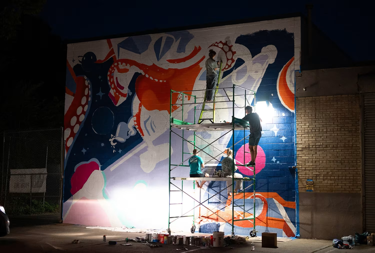
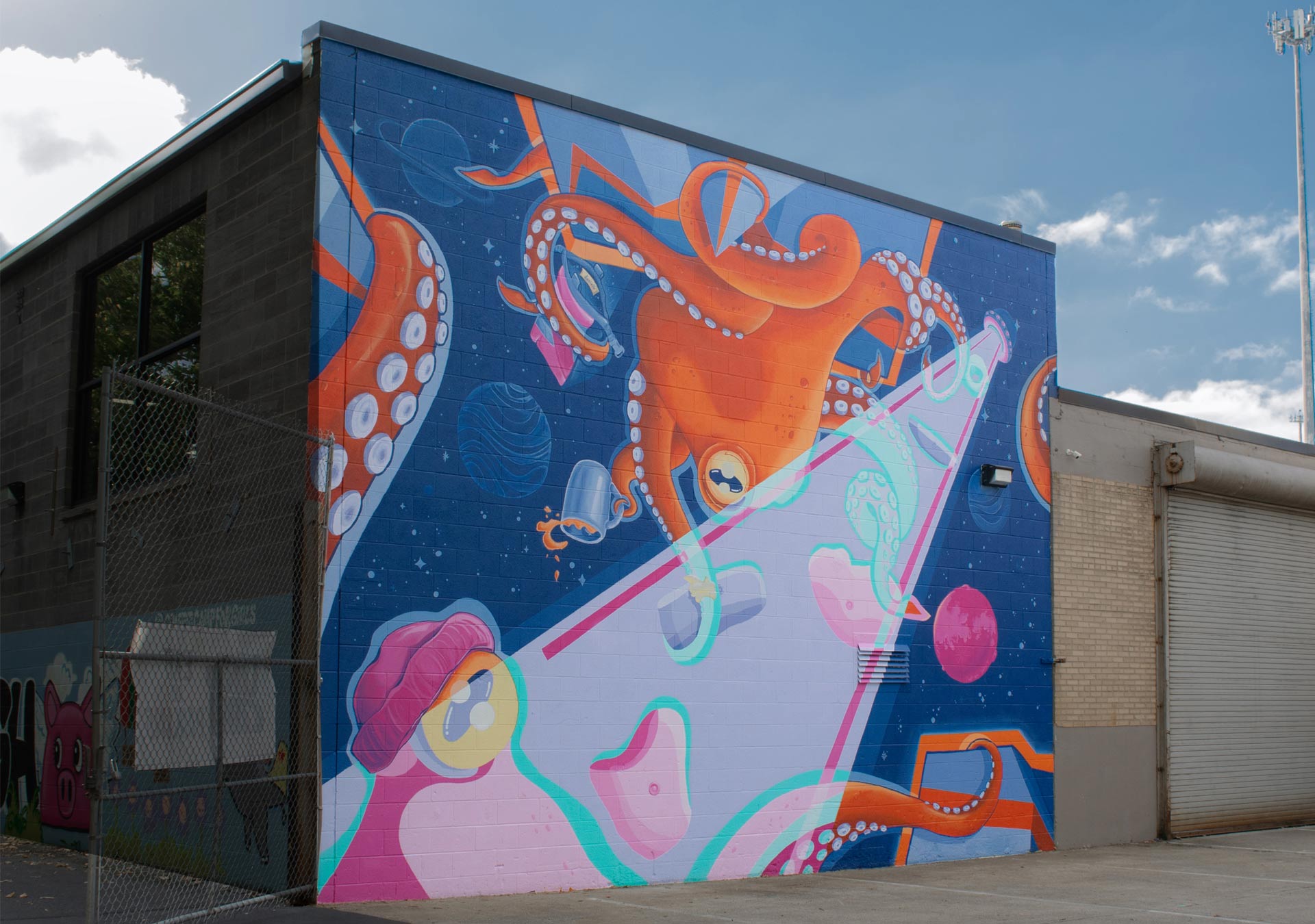
Public Art & Community Engagement

We approached the mural by first gathering input from the local climbing community through word-mapping exercises. This helped us identify themes of growth, inclusivity, nature, and fun. These ideas directly influenced our visual concept—blending surreal space imagery with climbing motifs to evoke wonder and joy. The project moved from a two-week design sprint to a one-week prep phase, followed by four weeks of on-site painting.

Execution began with wall preparation—cleaning and priming with over 12 gallons of primer—then projecting and tracing the composition onto the wall. As the painting progressed, we worked collaboratively to block in bold colors, layering details such as texture, highlights, and precise linework to bring the characters and setting to life. The mural’s imaginative style and vibrant palette invite engagement from both climbers and the broader community, creating a welcoming, expressive façade for Climb Cincy.

A community-driven mural in Northside, OH.

Prep & Tracing

Before painting, the team cleaned and primed the 432 sq. ft. wall, and applied over 12 gallons of primer. Using a projector, we traced the mural’s design onto the surface, marking key elements for accurate proportions to scale.

FILLING THE SHAPES WITH COLOR

With the foundation in place, the team worked collaboratively to block in the main colors.

Homepage Design

The store’s interface was built to be bold and dynamic, using thematic design elements like interactive menus and character animations to engage users. The navigation was structured for ease of use, with collections and categories clearly laid out for fans to quickly find their favorite items.

Inter-changeable Design

Scaleable: A flexible design system that accommodates frequent updates without compromising user experience—modular layouts with customizable content blocks for promotions, collections, and featured items.

Homepage & Banners

The homepage functioned as a hub for discovery, featuring rotating banners for new collections, seasonal promotions, and show-specific highlights. It combined bold visuals with a clean layout to prioritize ease of navigation and content visibility.

Menus & Browsing

The site was designed for an intuitive browsing experience, with streamlined navigation and visually engaging layouts. The design integrated rich media elements, such as dynamic banners and interactive menus, to evoke the cinematic experience associated with HBO.

Homepage

The homepage serves as the heart of the Yellowstone store, featuring a bold hero banner with iconic imagery, dynamic call-to-action buttons, and sections that guide visitors to bestsellers, new arrivals, and fan-favorites.

*A Case Study Note

While the client ultimately selected a traditional approach for the official site, I developed a modern iteration that introduced innovative design elements to elevate the shopping experience. This concept blended brand storytelling with user-centric functionality, offering a fresh perspective on how fans could engage with the show’s merchandise.

PDP & Collection Pages

Simplified path to purchase with intuitive features and navigation.

Quick Previews: Enabled users to view product details without leaving the current page.

Scaleable: A flexible design system that accommodates frequent updates without compromising user experience—modular layouts with customizable content blocks for promotions, collections, and featured items.

Brand Themes & Functionality

Our team focused on lifestyle imagery that captured the unique identity of each brand, helping the storefronts feel less transactional and more emotionally resonant.

For the Jeep storefront, for example, we developed themed collections like Outdoors, Active, and Travel—groupings that not only reflected Jeep’s authentic identity but also helped customers envision the products in real-life settings.

We also prioritized images featuring multiple products in one shot, which served a dual purpose: showcasing the brand and enabling the creation of shoppable banners and cross-sell opportunities.

No items found.
A Note —

Detailing & Touchups – The final stage focused on bringing the mural to life with highlights, shading, and intricate linework. This included refining edges, adjusting color balance, and adding smaller elements like texture and lighting effects.

No items found.